

Heidi Klum Rose in watercolor
How to paint the Heidi Klum Rose – Free Tutorial in watercolor


I have started with a new painting of the Heidi Klum Rose.
It needed some time with finding the right composition. This time I will have a lot of sunshine in the painting, especially later on the leaves and in the background.
Hopefully all works so how I want to have it. I think it is always an adventure to start a new painting and later to see the result. Often I am pleased, often I am stunned and often I am disappointed that it turned not so as I wanted to have it. And then I think … the next painting will be perfect … the next one. 🙂
I have done two photos. I was not able to paint very much and I needed to do a photo before it was too dark outside.
In the first one you will see the drawing, the photo is not the best. Sorry for that.
The painting will be around 10″x14″ in high format.
I paint on coldpressed 140 Lb Paper from Lanaquarelle (the same quality as Arches) and I paint directly on the block without stretching it. It works perfect.
The Heidi Klum Rose is a very pink/violet Rose. The petals in shadow are having a dark violet/blue colour.
I am using the following colours:
Permanent Rose and Alizarin Crimson for the very warm areas,
Purple Magenta is the “local” colour, which I also add to the warm and to the cool areas
Winsor Violet and a Mix of Purple Magenta for the cool areas and I add Helio Turqouise to this mix, when I want to have it darker. In the areas where are the really darks I am using a mix of Alizarin Crimson/a bit of Purple Magenta/some Winsor Violet and a bit of Sap Green, because these areas are not so cool, so I leave out the Helio Turquoise there.
I must add here, that I am playing with the colours and when the colour is dry I often see, that it looks not completely so as I wanted to have it, so I may go over this area again and then add another colour from the colours above. I also do not always mix on the palette. ON some petals I now simply wet the area and then drop the colours in which I want to have there and let them mix on the paper.
The leaves will bath in sunshine later. There are leaves which are looking more green and some are looking really blue and for this green/blue I will use the Helio Turquoise. I love this Colour and since I know that I will use it on the leaves I am using it also in the Rose. I simply thought I would try it out.
It also can happen that something doesn’t work, or the colours do look terrible, I then always start over to try to make it better. Don’t be afraid to play with your colours – I have figured out that often in the beginning it looks so lala and when you go on and see how the flower develops you will be very pleased. When not – start over and try it different again to get the result which you want. I cannot count how often I have started over and over with paintings, if this were flowers, Roses or figurative work. But since I am not afraid about this it makes it much easier and more relaxing to work on a piece and to try things out.

I have painted more on the petals, using all the colours, which I mentioned before. But I liked to switch over to the leaves and wanted to paint some of them, this gives me the feeling, that there is more happening on the white paper and I enjoy this. It also gives me a better feeling how the painting will look like, so I am painting then here and there on the mainsubject and here and there on the leaves.
For the leaves I used aureolin yellow, indian yellow, sap green, phthalo green and helio turquoise. I also used some of the Winsor Violet in the leaves. I like the different colours on the leaves, to have some warm and some cool and some darker and some very light. I love to go forward with this painting and I hope to post very soon better progress.
I was contacted by several people about my Demos of how I create my Rose paintings. I hope that my blog is also helpful for YOU and gives some inspiration. Please share it with your friends and link to my blog.

I am still working on the background with all the leaves and I really like how the painting is developing.
 I have worked more on this Heidi Klum Rose Painting.You see I have done a lot of progress and I really love how the painting develops. I only hope that I will also be pleased when it is finished. :)I have start to add darks to the background. Within all the leaves (there are really many leaves) I think this works the best. The darks have I created with Alizarin Crimson, Phthalo Green, Sap Green, Helio Turquoise, Winsor Violet, Ivory Black (but only mixed together with other colours) and here and there some Indian Yellow.To integrate the leaves into the background I have at first wet the area, where I wanted to paint the darks around the leave and then I simply moistened my brush with clear water and did wet the edges of the leaves. The result is that the still wet paint of the background runs over the leaves. This avoided hard edges at first and brings the leaves in the background that they are part of it.I really love the painting – the feeling of a hot summer day. I have only worked with transparent watercolors and have not used any masking fluid. I have painted around the whites.But I also have to add when you loose some highlights it is always possible to add then maybe a hint of white gouache to save your painting.
 Heidi Klum Rose, watercolor,
10″x16,5″, copyright: Doris Joa
SOLD


The painting of the Heidi Klum Rose is finished.
I did soften so many edges, but I still need again a closer look to see if I have maybe forgotten one or two.
The greys in the background at the top are a mix of sap green with winsor violet.
When you compare this photo to the photo in the post before you will notice that I have painted over some leaves, which were too white, it didn’t work and my eyes were still wandering there, especially to the leaves on the right side at the bottom.
When I was finished with the painting I did at first a photo and looked to it at the monitor. This helped me to see how distracting the hard edges were. So I used a flat brush and softened them.
Here is a photo of this brush, this works really perfect.


In the next photo I just would like to show how the painting looks before with some hard edges and how it looks after softening them. This may help for the beginners to get a good suggestion.
 You see in the left photo how distracting these edges are, here is a close up of the part which shows it much better. I think I should have done the photo then, before I softened the other edges and did think of showing this when the most were already softened. But I think you will get a good suggestion of what I mean.

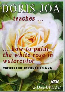
Watercolor DVDs
Watercolor Online Videos
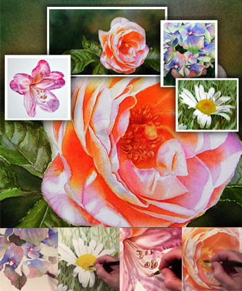
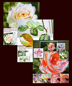

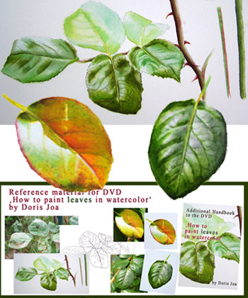
Watercolor E-book
Click here for more free Lessons for better paintings!
For more lessons just visit the Watercolor Lessons Section or have a look at my Rose Paintings Gallery. If you want to learn more then have a look at the Watercolor DVD section.
Leave a Reply
Want to join the discussion?Feel free to contribute!