
Watercolor Rose: Creating Depth with Glazes and Edges
FROM MY STUDIO · WATERCOLOR
Watercolor Rose: Creating Depth with Glazes and Edges
A rose can be carefully painted, with beautifully shaped petals and detailed leaves, and still need something more. In this painting, that something was depth. I want to show you how changing the background, the colour relationships and the edges changed the way the whole rose is seen.
Before and after: the real painting
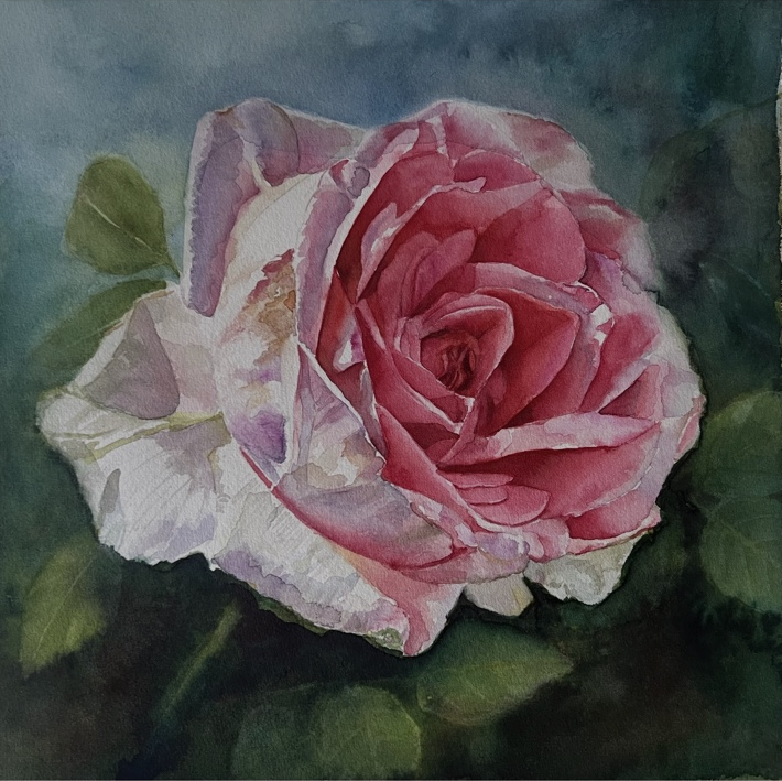
These two photographs show my actual watercolor before and after the changes. The earlier image has a lighter blue background and more clearly described foliage. In the later image, some of those leaves have become quieter, while the rose stands out more strongly.
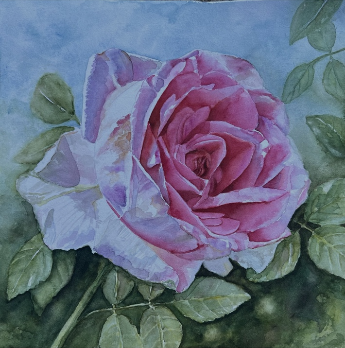
The photographs were taken separately, so lighting and camera colour may also differ. Look especially at the quieter foliage, the changing edges and the stronger separation between the rose and its surroundings.
Letting the background step back
In the earlier stage, many of the leaves were quite distinct. Their outlines and veins drew attention alongside the flower. I wanted the surrounding greenery to support the rose and give it space.
I deepened parts of the foliage with dark mixtures of Phthalo Green and Anthraquinoid Red, also using Sap Green and Payne’s Grey bluish. These mixtures gave me varied darks, with shifts between warmer and cooler areas. A background feels more alive when its shadows contain colour.
The changes were selective. Some leaves remain recognisable; others recede into shadow. This creates different planes rather than a single band of equally prominent foliage.
Keeping warmth within the shadows
I introduced Aureolin Yellow into wet areas to bring warmth into the greens. Those small warmer passages help the dark background retain life and variation. I also used Phthalo Blue for a blue glaze in the sky area, keeping an eye on its value so the sky would not become too dark.
What matters is the relationship between these areas: the cooler blue, the warm and cool greens, and the light petals. The background can become deeper while still holding light and colour.
Lost edges, found edges and soft transitions
A found edge is clearly visible. It separates one shape from another and can draw the eye. A soft edge is still visible, but the transition is gentle. A lost edge disappears where neighbouring shapes become similar in colour or value.
In the revised background, some leaf edges merge into the surrounding washes. Other edges remain clear. That variety helps the foliage sit at different depths and gives the eye places to rest. Around the rose, the changing relationship between a light petal and the darker greenery also makes its form easier to read.
An illustrated guide to the changes
The arrows in the following graphic explain the painting principles discussed above.
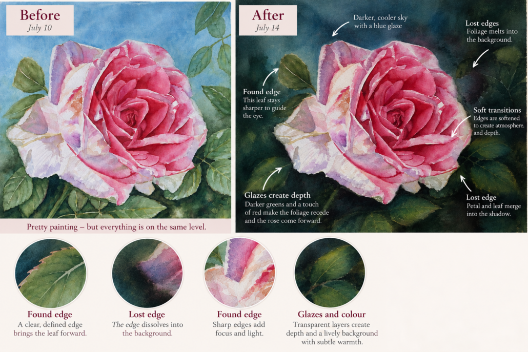
Reading the labels: “Found edge” means a clearly defined edge; “Lost edge” means an edge that blends into its surroundings; “Glazes create depth” refers to transparent layers that change colour and value. The blue-glaze label illustrates a cooler sky; in my painting I watched carefully that this area did not become too dark.
The colours I used
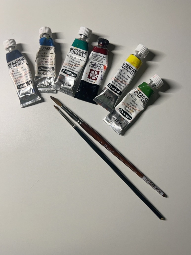
- Schmincke Horadam Phthalo Green
- Daniel Smith Anthraquinoid Red
- Schmincke Horadam Sap Green
- Schmincke Horadam Payne’s Grey bluish
- Schmincke Horadam Aureolin Yellow
- Schmincke Horadam Phthalo Blue
A question to ask when a painting feels flat
Before adding more detail, take a moment to look at the whole painting. Are the flower and the leaves asking for equal attention? Could a few softer edges or a quieter passage in the background give the main subject more space?
For this rose, the surrounding shapes made a substantial difference. Bringing some forward and letting others fade gave the flower a stronger presence, while keeping the fluid character of watercolor.