GENERAL ART LESSONS
DEMONSTRATIONS
ART MATERIALS
SPECIALS
Contact
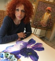
MEET THE ARTIST
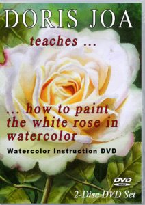
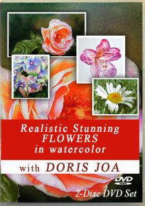
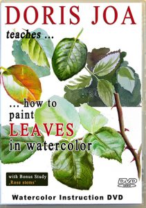
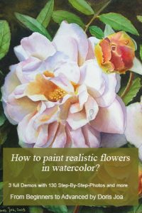
Doris Joa paints romantic realism in her favorite mediums watercolor and oil. She paints Flowers, Roses, Cats, Figures, Portraits & Colourful Horses. Her paintings can be found in many international collections. She teaches how to paint in her Watercolor Videos and is the author of the Instruction E-book ‘How to paint realistic flowers in watercolor’. Find joy and inspiration viewing her Fine Art and/or get help on your art journey with her Watercolor Videos, E-book, Free Art Lessons, Demonstrations and more.
WATERCOLOR EXTRA
COLOURS
Join Doris’ Mailing List
Subscribe to my Newsletter!
I guarantee 100% privacy.
Watercolor Videos / E-book