
Watercolor Colour Mixing
How to Mix Colourful Darks and Blacks
Dark passages do not have to look flat, lifeless or simply black. By mixing transparent pigments from your own palette, you can create deep, luminous darks that support the subject and add atmosphere to a watercolor painting.
Mix pure pigments
Two or three transparent colours can produce a rich dark with far more life than a single flat black.
Control the temperature
Change the ratio of red, green and blue to make your dark mixture warmer or cooler.
Support the focal point
Let complementary colours in the background strengthen the colour of your flower or main subject.
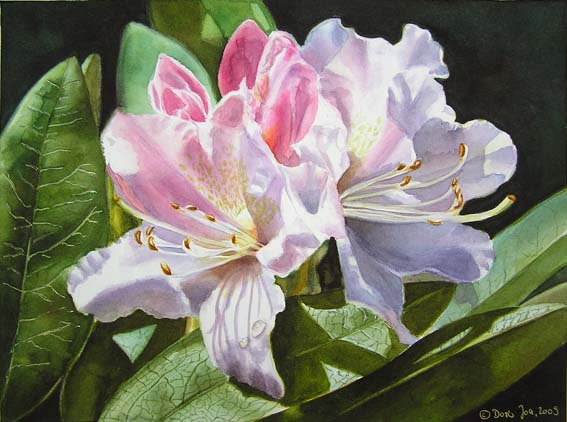
Should we mix our own black?
There is no absolute right or wrong. I sometimes use black from a tube, but in most of my paintings I prefer to mix dark colours from pure pigments already on my palette.
Especially in flower paintings, a colourful dark background can create atmosphere and make the lighter petals glow. Mixing the darks myself also allows me to use the complementary colours of the focal point throughout the background.
For beginners, this is a wonderful way to get to know the palette. Mix small samples, observe how the colours change and make notes about the combinations you would like to use again.
“Darks are colours, too.”
They can be deep brown, green, blue or violet—and still remain luminous.
Use complementary colours
Imagine you are painting a red rose. Green is the complementary colour of red, so a green-influenced dark can support the rose and help it stand out. For the background, I might mix Phthalo Green with Anthraquinoid Red and add a touch of blue. Together, the red and green can create a deep neutral; by favouring the green, the mixture becomes a dark green that beautifully supports the red flower.
For an orange rose, I can use the same family of red, green and blue pigments but allow more blue to remain visible. Because blue is complementary to orange, this creates a dark that strengthens the warmth of the flower.
The Rhododendron painting above was developed with mixtures of red, green and blue. The background reads as very dark, but it is not colourless.
Colour recipes for beautiful darks
Try these combinations on a separate sheet and notice whether each mixture leans towards black, brown, green, blue or violet:
+ Phthalo Green or Winsor Green
+ Ultramarine Blue
+ Cadmium Red or Scarlet Red
+ Cobalt Blue, with a touch of Anthraquinoid Red
+ Scarlet Red
+ Anthraquinoid Red and Winsor Green
My most important mixing tip
Vary the temperature by changing the ratio. In a mixture of Alizarin Crimson and Phthalo Green, more red creates a warmer dark, while more green produces a cooler dark. A touch of blue can shift it again. Let the colours move and change instead of mixing one identical black for the entire background.
What about Ivory Black?
I have used Ivory Black, too—but I rarely use it on its own. I mix it with one of my reds, blues, greens or yellows. This turns a flat black into a very dark version of that colour and makes it easier to integrate into the rest of the painting.
If Ivory Black feels too strong, try Payne’s Grey Bluish mixed with Sap Green for beautiful deep greens.

Related Free Video Lesson
How to Create a Beautiful Dark Background
See how I build transparent layers around a rose to create depth, atmosphere and strong contrast without losing the luminosity of the watercolor.
Continue Learning
Explore My Watercolor Masterclasses
Learn how I develop luminous flowers, realistic leaves and atmospheric backgrounds in complete step-by-step painting courses.